Death Cross: What It Means & How Reliable It Is
⚡ Key Takeaways
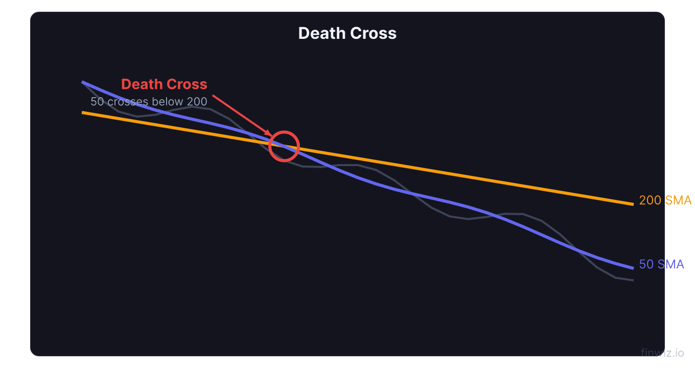
- A death cross occurs when the 50-day moving average crosses below the 200-day moving average, signaling a potential long-term bearish trend
- Historical data shows the S&P 500 has averaged a decline of 4-8% in the six months following a death cross, though outcomes vary widely
- Death crosses preceded major bear markets in 2000, 2008, and 2020, but also produced false signals during 2015-2016 and 2018
- The signal is a lagging indicator, meaning significant price damage has usually already occurred before the crossover forms
- Combining a death cross with breadth indicators and volume analysis helps distinguish genuine bear markets from temporary corrections
What Is a Death Cross?
A death cross is a bearish technical chart pattern that forms when a short-term moving average crosses below a long-term moving average. The most commonly referenced version occurs when the 50-day simple moving average (SMA) falls below the 200-day SMA. This crossover signals that recent price momentum has deteriorated to the point where it is dragging down even medium-term averages below long-term ones.
The death cross is the bearish counterpart to the golden cross, where the 50-day SMA crosses above the 200-day SMA. While the name sounds dramatic, a death cross does not guarantee a market crash. Its reliability varies significantly depending on market conditions and context.
The signal matters to traders and investors because it represents a measurable shift in trend dynamics. When the 50-day average falls below the 200-day average, it confirms that the average price over the past two-and-a-half months is lower than the average price over the past ten months, a clear sign that the prevailing trend has turned negative.
How the Death Cross Forms
The death cross develops through three phases, mirroring the golden cross in reverse.
Phase 1: Uptrend Deterioration. The stock or index has been in an uptrend, with the 50-day SMA above the 200-day SMA. Price begins making lower highs and lower lows. The 50-day SMA starts to flatten and then curves downward as recent prices weaken.
Phase 2: The Crossover. The 50-day SMA drops below the 200-day SMA. This is the actual death cross event. Volume may or may not increase at this point, though increasing volume adds to the signal's credibility.
Phase 3: Downtrend Confirmation. After the crossover, the 50-day SMA continues declining below the 200-day SMA. Both averages begin sloping downward, confirming the bearish trend. The 200-day SMA now acts as a resistance level during rally attempts.
50-Day SMA = Sum of last 50 closing prices / 50Historical Reliability Data
The death cross has a mixed but informative track record. Here is what the data reveals across different time horizons after the signal.
| Period After Death Cross | Average S&P 500 Return | Negative Return Rate |
|---|---|---|
| 1 month | -1.2% | 56% |
| 3 months | -2.8% | 54% |
| 6 months | -4.3% | 52% |
| 12 months | +2.1% | 42% |
A striking observation: while the death cross tends to produce negative returns over the short and medium term, the 12-month forward returns are actually slightly positive on average. This happens because death crosses often form near the end of corrections rather than at the start of them, and the subsequent recovery can be swift.
Pro Tip
Notable Death Cross Examples
The 2008 Financial Crisis
The S&P 500 formed a death cross in December 2007, just as the Great Recession was beginning. The index went on to lose approximately 50% from the death cross to the March 2009 bottom. This was one of the death cross's most successful bearish signals in modern history.
The 2020 COVID Crash
A death cross appeared on the S&P 500 in late March 2020, after the market had already crashed roughly 34% from its February highs. However, this turned out to be a terrible sell signal. The market bottomed on March 23rd, and the death cross formed just as prices were beginning their historic recovery. By June, the golden cross had already returned.
The 2015-2016 False Signal
In January 2016, the S&P 500 formed a death cross during the correction caused by China growth fears and an oil price collapse. The index had dropped about 12% from its highs. However, instead of continuing lower, the market reversed and rallied to new all-time highs within months.
The 2018 Near-Bear Market
A death cross formed on the S&P 500 in December 2018 after the Q4 selloff. The market had dropped approximately 20% from its September highs. Like 2016, this proved to be a false signal as stocks reversed sharply in early 2019.
When the Death Cross Works vs. When It Fails
Understanding the conditions that separate real death crosses from false signals is critical.
The death cross works best when:
- Fundamental deterioration accompanies it. The 2008 death cross worked because the financial system was genuinely breaking down. Economic indicators like unemployment, credit spreads, and manufacturing data were all deteriorating.
- Market breadth confirms the signal. When the majority of stocks in an index are below their own 200-day moving averages, the death cross is more likely to lead to further declines.
- Volume increases during the crossover. Heavy selling volume at the crossover confirms genuine distribution by institutional investors.
The death cross fails when:
- It forms after a sharp, news-driven decline. V-shaped corrections like COVID-2020 cause death crosses that form after the selling is already exhausted.
- Market breadth is improving. If the advance-decline line is rising even as the index forms a death cross, the signal is likely false.
- The decline was driven by a small number of stocks. A cap-weighted index can form a death cross due to weakness in a few mega-cap names while the broader market remains healthy.
How to Trade the Death Cross
Defensive Positioning
The most common use of the death cross is as a risk management signal. Long-term investors may reduce equity exposure, tighten stop losses, or increase cash positions when a death cross forms on major indices.
Short Selling
Active traders may initiate short positions when the death cross forms, placing stops above the 200-day SMA. This is a higher-risk approach because of the signal's tendency to generate false negatives.
Options-Based Hedging
Buying put options or put spreads when a death cross forms provides downside protection with defined risk. This approach is especially useful for portfolio hedging because you maintain your long positions while protecting against further decline.
Pro Tip
Death Cross vs. Golden Cross
These two signals are natural counterparts, but they are not symmetric in their reliability.
| Characteristic | Death Cross | Golden Cross |
|---|---|---|
| Signal Direction | Bearish | Bullish |
| Historical Win Rate (12-month) | ~42% (negative return) | ~73% (positive return) |
| Average 12-Month Return | +2.1% | +12.4% |
| False Signal Frequency | Higher | Lower |
| Best Used As | Risk management tool | Trend confirmation |
The asymmetry exists because stock markets have a long-term upward bias. This makes bearish signals inherently less reliable than bullish ones. The market spends more time going up than going down, so death crosses are more often interruptions in uptrends than the beginning of sustained bear markets.
Improving Death Cross Signals
Several filters can help you distinguish meaningful death crosses from false alarms.
Check the slope of the 200-day SMA. A death cross where the 200-day SMA is still rising is far less ominous than one where the 200-day SMA has already started declining. A declining 200-day SMA indicates that the longer-term trend has genuinely shifted.
Monitor the MACD. If MACD is below zero and declining when the death cross forms, bearish momentum is confirmed. If MACD is already turning upward from deeply negative levels, the worst may be over.
Review economic data. Death crosses that coincide with deteriorating economic fundamentals (rising unemployment, inverted yield curves, declining PMI data) are more likely to precede extended bear markets.
Watch credit markets. Widening credit spreads (the difference between corporate bond yields and Treasury yields) alongside a death cross suggest genuine financial stress, not just a technical correction.
Death Cross on Individual Stocks
While most analysis focuses on index-level death crosses, the signal applies to individual stocks as well. However, there are important differences.
Individual stocks are more volatile than indices, so death crosses form more frequently and are more prone to false signals. A stock in a range-bound pattern can generate multiple death crosses and golden crosses in a single year, each one a potential whipsaw.
The death cross is more useful on individual stocks when combined with fundamental deterioration such as declining revenue, shrinking margins, or analyst downgrades. A death cross on a stock with strong and improving fundamentals is often a buying opportunity rather than a sell signal.
FAQ
Does a death cross mean the market will crash?
No. While death crosses have preceded some major bear markets, they also produce frequent false signals. Historically, the S&P 500 has actually averaged slightly positive returns in the 12 months following a death cross, because many death crosses form near the end of corrections.
How long does a death cross last?
The duration between a death cross and the subsequent golden cross varies widely. During the 2008 crisis, the death cross persisted for approximately 15 months. During the 2020 COVID event, it lasted only about 3 months. On average, death crosses persist for 6-12 months.
Should I sell all my stocks when a death cross forms?
Selling everything based on a single technical signal is rarely advisable. A more measured approach involves reducing position sizes, tightening stop losses, and increasing cash or hedges. This way you are protected if the death cross leads to further declines but still participate if it turns out to be a false signal.
Is the death cross more reliable on weekly charts?
Yes, weekly chart death crosses (10-week SMA below 40-week SMA) produce fewer signals and tend to be more reliable. However, they are even more lagging than daily chart death crosses, so the timing tradeoff is significant.
How is the death cross different from a simple pullback?
A pullback is a temporary decline within an ongoing uptrend where the 50-day SMA remains above the 200-day SMA. A death cross represents a deeper structural shift where recent average prices have fallen below the long-term average, suggesting a potential change in the primary trend.
Disclaimer
This is educational content, not financial advice. Trading involves risk, and you should consult a qualified financial advisor before making any investment decisions. Past performance does not guarantee future results.
Related Articles
12 chapters covering charts, indicators, risk management & more. Plus weekly trading insights.