Point and Figure Charts: The Classic Method for Filtering Noise
⚡ Key Takeaways
- Point and Figure (P&F) charts use columns of Xs (rising prices) and Os (falling prices) to map price movement, ignoring time and volume entirely to focus on pure supply-and-demand dynamics.
- The two key settings are the box size (the minimum price move to add an X or O) and the reversal amount (how many boxes price must move in the opposite direction to start a new column, typically 3 boxes).
- P&F charts generate clear buy and sell signals through simple pattern recognition: a double-top breakout (buy) occurs when a column of Xs exceeds the previous X column's high, and a double-bottom breakdown (sell) occurs when Os fall below the prior O column's low.
- P&F charts provide built-in price targets using horizontal and vertical count methods, giving traders specific price objectives that time-based charts do not offer.
- Despite being over 100 years old, P&F charts remain valuable for their objectivity — signals are black-and-white with no room for subjective interpretation.
What Are Point and Figure Charts?
Point and Figure (P&F) charts are one of the oldest charting methods in technical analysis, dating back to the late 1800s when traders tracked prices by hand on graph paper. Unlike candlestick charts that plot price over time, P&F charts plot price against itself — recording only significant price changes and ignoring both time and volume.
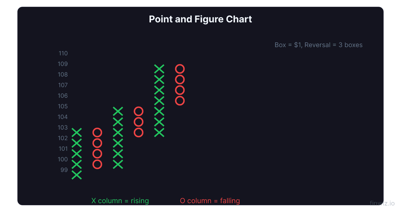
The chart consists of columns of Xs (representing rising prices) and Os (representing falling prices). A column of Xs means buyers are in control. A column of Os means sellers are in control. When one column ends and the other begins, a shift in control has occurred.
What makes P&F charts unique is their complete disregard for time. A single column of Xs might represent one day of trading or three months — the chart does not distinguish between the two. This time-agnostic property eliminates noise from consolidation periods and presents a pure picture of supply and demand battles at specific price levels.
How Point and Figure Charts Are Constructed
Box Size
The box size determines the minimum price increment represented by each X or O. If the box size is $1, each X or O represents a $1 price move. Common box size approaches:
- Fixed dollar amount: $0.50, $1, $2, $5 depending on stock price
- Percentage-based: 1% of the stock price
- ATR-based: Use the Average True Range for dynamic sizing
For a stock trading at $100 with a $2 box size:
- If price rises from $100 to $102, one X is added
- If price rises from $102 to $106, two more Xs are added (at $104 and $106)
- If price rises from $106 to $106.50, no new X is added (did not reach $108)
Reversal Amount
The reversal amount determines how many boxes price must move in the opposite direction to start a new column. The standard and most common reversal amount is 3 boxes.
In a 3-box reversal with a $2 box size, price must reverse by $6 (3 x $2) to trigger a column change. This means minor pullbacks of less than $6 are ignored entirely — only significant reversals create new columns.
P&F Chart Construction Example:The Construction Process Step by Step
- Determine the box size and reversal amount (e.g., $2 box, 3-box reversal)
- Start with the first significant price move — plot Xs going up or Os going down
- Continue adding Xs or Os in the same column as price moves in the same direction by at least one box size
- When price reverses by the reversal amount, move one column to the right and begin plotting in the opposite direction (Os after Xs, or Xs after Os)
- The first mark in a new column always starts one box above or below the last mark in the previous column
Pro Tip
X Columns and O Columns: Reading the Chart
X Columns (Demand in Control)
A column of Xs means price is rising. Each new X added represents buyers pushing price higher by at least one box size. A tall column of Xs (many Xs) indicates strong, persistent buying pressure. A short column of Xs (few Xs before reversing into Os) indicates weak or tentative demand.
O Columns (Supply in Control)
A column of Os means price is falling. Each new O represents sellers pushing price lower by one box size. A tall column of Os indicates aggressive selling, while a short column of Os suggests the selling pressure was limited.
Column Analysis
The relative height of successive X and O columns tells a story:
- Progressively taller X columns with shorter O columns: Strong uptrend — buyers are gaining strength while sellers are weakening
- Progressively taller O columns with shorter X columns: Strong downtrend — sellers are gaining strength while buyers are weakening
- Equal-height alternating columns: Range-bound market with balanced supply and demand
P&F Buy and Sell Signals
Double-Top Breakout (Buy Signal)
The most basic and most reliable P&F buy signal is the double-top breakout. It occurs when a column of Xs rises above the highest X in the previous X column.
This signal means that current buying pressure has exceeded the level where sellers previously stopped the advance. Demand has overcome the supply that created the prior resistance.
Double-Bottom Breakdown (Sell Signal)
The inverse is the double-bottom breakdown, where a column of Os falls below the lowest O in the previous O column. Current selling pressure has broken through the level where buyers previously stepped in.
Triple-Top and Triple-Bottom Breakouts
Triple-top breakouts occur when Xs exceed a resistance level that has been tested three times (three X columns reached the same level before breaking through). These are stronger signals than double-top breakouts because the resistance level has been tested and held multiple times, making the eventual breakout more significant.
Triple-bottom breakdowns are the bearish equivalent — three O columns reaching the same support level before finally breaking through.
More Advanced Patterns
| Pattern | Signal | Strength |
|---|---|---|
| Double-top breakout | Buy | Moderate |
| Triple-top breakout | Buy | Strong |
| Ascending triple-top | Buy | Very strong |
| Bullish catapult | Buy | Very strong |
| Double-bottom breakdown | Sell | Moderate |
| Triple-bottom breakdown | Sell | Strong |
| Descending triple-bottom | Sell | Very strong |
| Bearish catapult | Sell | Very strong |
The catapult pattern is a double-top breakout followed by a pullback that holds above the breakout level, then another advance. It confirms the breakout and signals strong trend continuation.
Price Targets: Horizontal and Vertical Counts
One of the most unique advantages of P&F charts is their ability to generate specific price targets. No other charting method provides this capability with the same objectivity.
Vertical Count Method
The vertical count projects a target based on the length of the current column (the thrust that triggered the breakout).
Vertical Count (Buy Signal):Horizontal Count Method
The horizontal count projects a target based on the width of a congestion (consolidation) pattern — the number of columns within the pattern.
Horizontal Count (Buy Signal):The horizontal count is generally considered more reliable because it accounts for the duration of the supply/demand battle during consolidation. Wider consolidation patterns (more columns) produce higher targets, reflecting greater accumulation or distribution.
Pro Tip
P&F Trend Lines
45-Degree Trend Lines
P&F charts use a unique trend line system based on 45-degree angles drawn from significant lows (bullish support line) or significant highs (bearish resistance line).
- Bullish support line: Drawn upward at 45 degrees from the lowest O in a significant bottom. As long as O columns stay above this line, the uptrend is intact.
- Bearish resistance line: Drawn downward at 45 degrees from the highest X in a significant top. As long as X columns stay below this line, the downtrend is intact.
These trend lines are completely objective — there is no subjective judgment about where to draw them. The 45-degree angle is fixed, and the starting point is the extreme high or low.
Trend Line Breaks
When an X column penetrates above a bearish resistance line, it generates a buy signal. When an O column penetrates below a bullish support line, it generates a sell signal. These trend line breaks, combined with the breakout patterns discussed earlier, create a comprehensive signal system.
Comparing P&F to Other Chart Types
P&F vs. Candlestick Charts
P&F charts provide clearer trend signals and objective price targets, but sacrifice time information and the rich pattern language of candlestick patterns. Most traders use P&F charts for macro trend analysis and signal generation while using candlestick charts for tactical entry and exit timing.
P&F vs. Renko Charts
Both P&F and Renko charts ignore time and focus on price movement. The key differences:
- P&F uses Xs and Os in columns; Renko uses uniform bricks
- P&F has a configurable reversal amount; Renko always requires a 1-brick reversal (which equates to a 2-brick move from the extreme)
- P&F generates specific price targets; Renko does not
- Renko is visually simpler; P&F contains more analytical depth
P&F vs. Line Charts
Line charts and P&F charts both simplify price data, but P&F charts preserve far more information about supply/demand battles at specific price levels.
Practical P&F Trading Strategy
Step 1: Determine the Major Trend
Look at a P&F chart with a larger box size to identify whether the stock is in a bullish or bearish trend. Use the 45-degree trend lines to confirm.
Step 2: Wait for Signals in Trend Direction
Only take buy signals (double-top breakouts, triple-top breakouts) when the major trend is bullish. Only take sell signals in bearish major trends. This trend-following filter eliminates many false signals.
Step 3: Set Price Targets
Calculate both horizontal and vertical count targets. Use the more conservative target as your primary exit point.
Step 4: Set Stop-Loss Levels
Place stops at the opposite signal level — if you bought on a double-top breakout, set your stop at the level where a double-bottom breakdown would occur.
Step 5: Manage the Trade
Let the trade run as long as the P&F chart continues generating signals in your direction. Add to the position on subsequent breakout signals if the risk/reward remains favorable.
FAQ
Are Point and Figure charts still relevant today?
Yes. Despite being over a century old, P&F charts remain valuable precisely because they cut through the noise that plagues modern markets. Algorithmic trading has increased short-term market noise, making the P&F chart's noise-filtering properties more useful than ever. Many professional technicians and commodity traders continue to use P&F analysis alongside modern methods.
What box size should I use for Point and Figure charts?
For stocks in the $20-$50 range, a $1 box size is common. For stocks in the $50-$200 range, a $2 box size works well. For stocks above $200, use $5 or higher. Alternatively, use 1-2% of the stock's price for automatic scaling. The ATR-based method is the most adaptive approach.
Can I use Point and Figure charts for day trading?
Yes, but with smaller box sizes and potentially a 1-box reversal (called a "one-box reversal" or "swing chart"). Some day traders use P&F charts on intraday data with tick-level or minute-level inputs. The signals are more frequent but also more prone to false signals than the standard 3-box reversal.
How do I create P&F charts on my trading platform?
TradingView, StockCharts.com, and thinkorswim all support P&F charting. On TradingView, select "Point & Figure" from the chart type dropdown. StockCharts.com has been one of the most popular platforms for P&F analysis for decades and offers extensive P&F screening tools.
What is the success rate of P&F signals?
Studies show that P&F double-top breakout signals in stocks above their 45-degree bullish support line have a success rate of approximately 65-75% when measured over the following 3-6 months. Success rates improve significantly when signals are taken only in the direction of the major trend and when multiple confirming signals align.
Disclaimer
This is educational content, not financial advice. Trading involves risk, and you should consult a qualified financial advisor before making any investment decisions. Past performance does not guarantee future results.
Related Articles
12 chapters covering charts, indicators, risk management & more. Plus weekly trading insights.