How to Read Stock Charts: The Ultimate Visual Guide
⚡ Key Takeaways
- Stock charts display price action over time using candlesticks, bars, or lines — candlestick charts are the most informative for active traders
- Volume confirms the strength of price moves: rising price on rising volume signals conviction, rising price on falling volume signals weakness
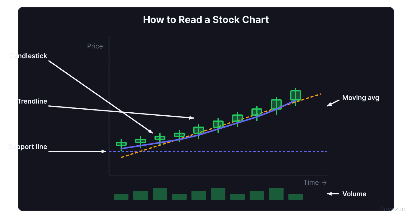
- Key chart components include candlesticks, support and resistance levels, trend lines, volume bars, and technical indicators
- Different timeframes tell different stories — always align your chart timeframe with your trading strategy
Why Stock Charts Matter
Every price on a stock chart represents a transaction between a buyer and a seller. When you learn to read charts, you are reading the collective decisions of millions of market participants — institutional funds, retail traders, algorithms, and market makers. Charts compress all available information into a visual format that reveals trends, reversals, and opportunities.
Stock charts are the primary tool of technical analysis. Fundamental analysis tells you what to buy. Technical analysis tells you when. Whether you trade AAPL, TSLA, or small-cap momentum plays, the ability to read a chart separates informed decisions from blind guesses.
This guide covers the five core components of any stock chart: candlesticks, volume, indicators, patterns, and timeframes. Master each one, and you will be able to look at any chart and extract actionable information within seconds.
Candlestick Basics
Candlestick charts originated in 18th-century Japan and remain the most widely used chart type among traders today. Each candlestick represents a specific time period and displays four data points: open, high, low, and close.
A bullish candle (typically green or white) forms when the close is above the open — buyers controlled the session. A bearish candle (typically red or black) forms when the close is below the open — sellers dominated. The thick part of the candle is the body, and the thin lines extending above and below are wicks (also called shadows).
The body shows you who won the battle between buyers and sellers. The wicks show you the extremes that were rejected. A long lower wick on a bullish candle, for example, means sellers pushed the price down but buyers overwhelmed them and drove it back up — a sign of strength.
For a deeper breakdown of the parts of each candle, see our candlestick anatomy guide. Once you understand individual candles, you can study multi-candle formations in our candlestick patterns guide. Patterns like the engulfing, doji, and hammer appear on every chart and signal potential reversals or continuations.
Reading Volume
Volume measures the number of shares traded during a given period. It appears as vertical bars along the bottom of most chart platforms. Volume is the single most important confirmation tool in technical analysis.
Here is the core principle: price tells you what is happening; volume tells you how much conviction is behind it.
| Price Action | Volume | Interpretation |
|---|---|---|
| Price rising | Volume rising | Strong uptrend, buyers in control |
| Price rising | Volume falling | Weak rally, potential reversal ahead |
| Price falling | Volume rising | Strong selling pressure, downtrend likely continues |
| Price falling | Volume falling | Selling exhaustion, potential bottom forming |
When NVDA broke above $500 in late 2024, volume surged to 3x its average — a textbook confirmation of a legitimate breakout. Contrast that with a low-volume drift upward, which often fails and reverses. Always check volume before acting on a price move.
For advanced techniques including volume profile and on-balance volume, read our volume analysis guide.
Pro Tip
Support, Resistance, and Trend Lines
Support is a price level where buying demand consistently prevents the stock from falling further. Resistance is a price level where selling pressure consistently prevents the stock from rising higher. These levels form because traders remember prices — if AMZN bounced off $170 three times, traders will place buy orders near $170 again, reinforcing the level.
Drawing these levels is straightforward: connect two or more price touches at the same horizontal level. The more touches, the stronger the level. When support breaks, it often becomes resistance, and vice versa. This concept is called polarity and is one of the most reliable principles in charting.
Trend lines connect a series of higher lows (uptrend) or lower highs (downtrend) to define the trajectory of a move. A stock trading above a rising trend line is in an uptrend until it breaks below. META's rally from its 2022 lows to its 2024 highs followed a clear ascending trend line that provided multiple buying opportunities on pullbacks.
Learn how to draw and validate these levels in our support and resistance guide, and explore advanced trend line techniques for identifying entries and exits.
Technical Indicators
Technical indicators are mathematical calculations applied to price and volume data. They fall into two broad categories:
Trend indicators help you identify the direction of the market. The most common are:
- Moving averages (SMA, EMA) — smooth out price data to reveal the underlying trend. The 50-day and 200-day moving averages are watched by virtually every institutional trader.
- MACD — measures the relationship between two moving averages to identify momentum shifts and crossovers.
Oscillators help you identify overbought or oversold conditions:
- RSI (Relative Strength Index) — ranges from 0 to 100. Readings above 70 suggest overbought conditions; below 30 suggest oversold.
- Stochastic — compares a stock's closing price to its price range over a set period to gauge momentum.
RSI = 100 - [100 / (1 + (Average Gain / Average Loss))]No single indicator is reliable on its own. The best traders use confluence — multiple indicators and chart elements agreeing on the same signal. When RSI shows oversold at a support level with a bullish candlestick pattern and rising volume, the probability of a bounce increases significantly.
Choosing the Right Timeframe
The timeframe you select on your chart determines what each candlestick represents. A 5-minute chart shows one candle per five minutes of trading. A daily chart shows one candle per trading day. A weekly chart shows one candle per week.
| Trading Style | Primary Timeframe | Higher Timeframe for Context |
|---|---|---|
| Scalping | 1-minute, 5-minute | 15-minute, 1-hour |
| Day trading | 5-minute, 15-minute | 1-hour, daily |
| Swing trading | Daily | Weekly |
| Position trading | Weekly | Monthly |
Multi-timeframe analysis is the practice of checking a higher timeframe before executing on your primary timeframe. If you day trade using the 5-minute chart, check the daily chart first. If the daily trend is bearish, taking long trades on the 5-minute chart means fighting the larger trend — a low-probability approach.
When TSLA consolidated on the daily chart near $250 in early 2025, day traders who checked the daily saw a clear range. They could then use the 5-minute chart to scalp between the range boundaries rather than betting on a breakout that had not occurred.
For a full breakdown of how to use each timeframe effectively, see our chart timeframes guide.
Putting It All Together
Reading a stock chart is a systematic process, not a guessing game. Every time you open a chart, follow this sequence:
- Identify the trend on the higher timeframe using trend lines and moving averages.
- Mark key support and resistance levels where price has reacted multiple times.
- Drop to your trading timeframe and look for candlestick patterns or setups near those levels.
- Check volume to confirm that the setup has conviction behind it.
- Use indicators for additional confluence — not as standalone signals.
This five-step process keeps your analysis structured and prevents the common mistake of cherry-picking evidence to support a bias. The chart tells you what is happening. Your job is to listen.
Frequently Asked Questions
What is the best chart type for beginners?
Candlestick charts are the best starting point. They display more information than line charts (which only show closing prices) and are easier to interpret than bar charts. Once you understand how to read individual candles and basic patterns, you can extract meaningful information from any stock chart.
How many indicators should I use on a chart?
Two to three is the practical maximum. Using more creates conflicting signals and analysis paralysis. A common combination is one trend indicator (such as a 20 EMA and 50 SMA) plus one oscillator (such as RSI). Combine these with support and resistance levels and volume for a complete picture.
Can stock charts predict the future?
Charts do not predict the future. They identify probabilities based on historical price behavior. When a stock approaches a support level that has held five times, the probability of another bounce is higher than a random price level — but it is never certain. The edge in chart reading comes from identifying high-probability setups and managing risk when the setup fails.
12 chapters covering charts, indicators, risk management & more. Plus weekly trading insights.