How to Read Stock Charts: A Complete Beginner's Guide
⚡ Key Takeaways
- Stock charts visually represent price movement over time and are the foundation of technical analysis
- The three main chart types are line charts, bar charts, and candlestick charts, each offering different levels of detail
- Volume bars beneath the price chart confirm the strength or weakness of price movements
- Choosing the right timeframe depends on your trading style, from 1-minute charts for scalpers to monthly charts for investors
- Technical indicators like moving averages and RSI overlay on charts to help identify trends and potential reversals
Why Learning to Read Stock Charts Matters
Every successful trader and investor shares one skill: the ability to read stock charts. Charts are the universal language of the financial markets. They compress thousands of data points into a visual story about supply, demand, and market sentiment.
Whether you plan to hold stocks for years or trade them for minutes, understanding chart basics gives you a significant edge. You will be able to spot trends before they become obvious, identify support and resistance levels, and time your entries and exits with greater precision.
This guide walks you through every essential element of a stock chart, from the different chart types to reading volume and applying your first indicators.
The Three Main Chart Types
Not all charts display price data the same way. The three most common types are line charts, bar charts, and candlestick charts. Each has a specific use case.
Line Charts
A line chart connects closing prices over a given period with a single continuous line. It is the simplest chart type and is excellent for seeing the big picture of a stock's trend.
Line charts strip away noise. They do not show intraday highs, lows, or opening prices. This makes them ideal for long-term investors who want a clean view of whether a stock is trending up, down, or sideways.
The downside is that you lose a great deal of detail. You cannot see how volatile each session was or whether buyers or sellers controlled the day.
Bar Charts (OHLC)
A bar chart, also called an OHLC chart, shows four data points for each period: the open, high, low, and close. Each period is represented by a vertical line with small horizontal ticks on the left (open) and right (close).
Bar charts give you much more information than line charts. You can see the full trading range, whether the stock closed higher or lower than it opened, and how much ground it covered during each session.
Bar charts were the standard before candlestick charts gained popularity in the West. Some veteran traders still prefer them.
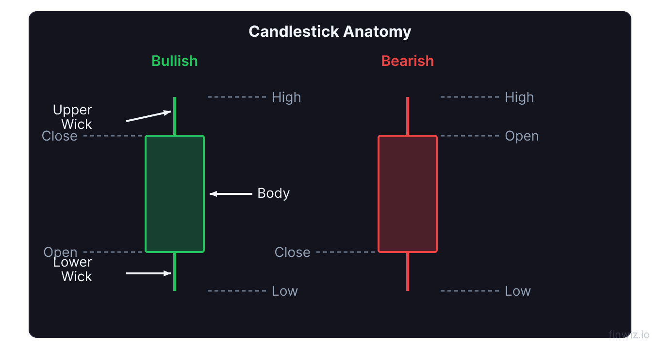
Candlestick Charts
Candlestick charts display the same four data points as bar charts but in a visually richer format. Each period is represented by a rectangular body and two wicks (also called shadows).
The body shows the range between the open and close. If the close is higher than the open, the candle is typically green or white (bullish). If the close is lower, the candle is red or black (bearish). The wicks extend from the body to the high and low of the period.
Candlestick charts are the most popular chart type among active traders because individual candles and candle patterns communicate market psychology at a glance. Patterns like doji, hammer, and engulfing candles provide actionable signals.
Pro Tip
Understanding Timeframes
The timeframe you select determines how much price data each candle or bar represents. Common timeframes include:
| Timeframe | Each Candle Represents | Best For |
|---|---|---|
| 1-minute | 1 minute of trading | Scalping |
| 5-minute | 5 minutes of trading | Day trading |
| 15-minute | 15 minutes of trading | Day trading |
| 1-hour | 1 hour of trading | Day / swing trading |
| Daily | 1 full trading session | Swing trading |
| Weekly | 1 week of sessions | Position trading |
| Monthly | 1 month of sessions | Long-term investing |
Shorter timeframes contain more noise but allow you to see granular price action. Longer timeframes smooth out volatility and reveal the dominant trend.
Most traders use multiple timeframes together. For instance, a swing trader might check the weekly chart for the major trend, the daily chart for trade setup, and the hourly chart for precise entry timing. Learn more in our guide to multiple time frame analysis.
Reading the Price Axis and Time Axis
Every stock chart has two axes. The vertical axis (y-axis) displays price. The horizontal axis (x-axis) displays time.
Most charting platforms allow you to switch between a linear scale and a logarithmic scale on the price axis. On a linear scale, equal vertical distances represent equal dollar amounts. On a logarithmic scale, equal vertical distances represent equal percentage moves.
Logarithmic charts are essential when analyzing stocks that have moved dramatically in price. A stock that went from 10 to 20 dollars doubled in value, just as a stock that went from 100 to 200 dollars did. On a log chart, both moves appear the same size, giving you a more accurate picture of proportional gains.
Pro Tip
Volume: The Confirmation Tool
Beneath the price chart, you will typically find volume bars. Volume represents the total number of shares traded during each period.
Volume confirms price moves. A price advance on high volume is more trustworthy than one on low volume, because high volume means more market participants are supporting the move. Similarly, a price decline on heavy volume signals strong selling pressure.
Key volume concepts to understand:
- Above-average volume on a breakout confirms the move is legitimate
- Below-average volume on a pullback suggests the dip is temporary
- Climax volume (an extreme spike) often occurs at turning points
- Dry-up volume (very low volume) can precede a big move in either direction
For a deeper dive, see our complete guide to volume analysis.
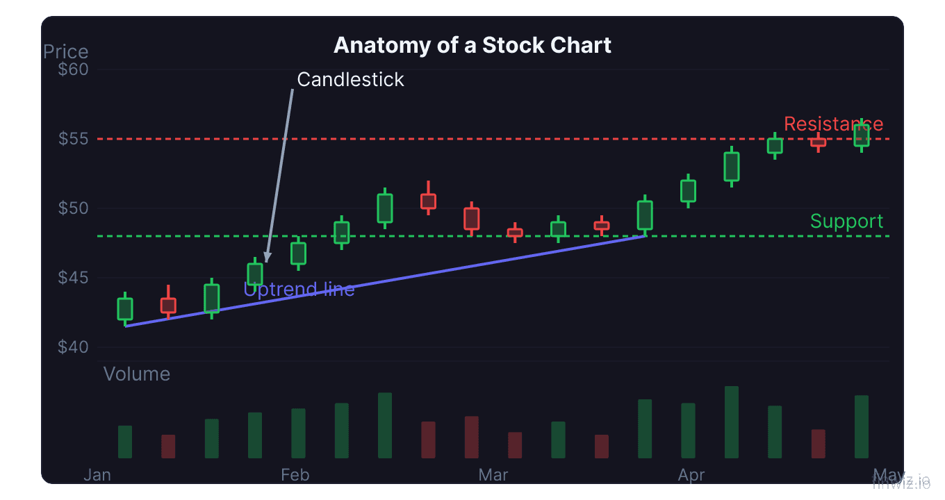
Support and Resistance on the Chart
Two of the most important concepts you will encounter on any chart are support and resistance.
Support is a price level where buying interest is strong enough to prevent the price from falling further. On the chart, it appears as a price zone where the stock has bounced upward multiple times.
Resistance is a price level where selling pressure prevents the price from rising further. It shows up as a ceiling that the stock has failed to break through.
When support breaks, it often becomes resistance, and vice versa. This concept is called role reversal and is one of the most reliable patterns in technical analysis. Our detailed guide on support and resistance covers identification techniques and trading strategies.
Your First Indicators
Technical indicators are mathematical calculations plotted on or below the price chart. They help quantify trends, momentum, volatility, and volume in ways that the raw chart cannot.
Moving Averages
A moving average smooths out price data by creating a constantly updated average price. The two most common types are the Simple Moving Average (SMA) and the Exponential Moving Average (EMA).
SMA = (Sum of closing prices over N periods) / NThe 50-day and 200-day moving averages are the most widely watched. When the 50-day crosses above the 200-day, it is called a golden cross (bullish). When it crosses below, it is called a death cross (bearish).
Relative Strength Index (RSI)
The RSI is a momentum oscillator that ranges from 0 to 100. Readings above 70 suggest a stock is overbought, while readings below 30 suggest it is oversold. The RSI helps you gauge whether a stock's recent price movement has been excessively strong or weak.
MACD
The Moving Average Convergence Divergence (MACD) measures the relationship between two moving averages. It consists of the MACD line, the signal line, and a histogram. When the MACD line crosses above the signal line, it is a bullish signal. When it crosses below, it is bearish.
Putting It All Together
Reading a stock chart is a layered process. Start with the big picture and then drill down:
- Identify the trend: Is the stock making higher highs and higher lows (uptrend), lower highs and lower lows (downtrend), or moving sideways?
- Check key levels: Where are the major support and resistance zones?
- Read the candles: What is the most recent price action telling you about buyer and seller dynamics?
- Confirm with volume: Is volume supporting the current price move?
- Apply indicators: Do your indicators (moving averages, RSI, MACD) agree with your assessment?
This layered approach prevents you from jumping to conclusions based on a single data point. The best trades occur when price, volume, and indicators all align.
Common Mistakes Beginners Make
New chart readers often fall into predictable traps:
- Using too many indicators: More indicators do not mean better analysis. Two or three well-understood tools are far more effective than a cluttered chart.
- Ignoring the trend: Trading against the dominant trend is one of the fastest ways to lose money. Always know the direction of the larger trend.
- Forgetting volume: Price moves without volume confirmation are unreliable. Always check volume.
- Anchoring to a single timeframe: The 5-minute chart might look bullish while the daily chart is clearly bearish. Use multiple time frame analysis to avoid this trap.
- Seeing patterns that are not there: Confirmation bias is real. If you want to see a bullish setup, you will find one. Stay objective.
Frequently Asked Questions
What is the best chart type for beginners?
Candlestick charts are the best starting point. They contain the most information (open, high, low, close) and are visually intuitive. Patterns formed by individual candles and groups of candles provide immediate trading signals. Start by learning to read single candle shapes before moving on to multi-candle patterns.
Which timeframe should I use?
The best timeframe depends on your trading style. If you are a day trader, focus on 5-minute and 15-minute charts. If you are a swing trader, use the daily chart as your primary view. If you are a long-term investor, weekly and monthly charts are most appropriate. Regardless of your style, always check at least one higher timeframe for context.
How many indicators should I put on my chart?
Keep your chart clean. Two to three indicators are typically sufficient. A good starting combination is one trend indicator (such as a moving average), one momentum indicator (such as the RSI), and volume. Adding more indicators often creates conflicting signals and analysis paralysis.
Can stock charts predict the future?
Stock charts do not predict the future with certainty. What they do is reveal probabilities. Certain patterns and indicator readings have historically led to specific outcomes more often than not. Technical analysis is about tilting the odds in your favor, not guaranteeing outcomes.
Is technical analysis enough, or do I need fundamentals too?
Many successful traders use technical analysis exclusively, especially for short-term trading. However, combining technical and fundamental analysis gives you a more complete picture, particularly for longer holding periods. Technicals tell you when to buy or sell; fundamentals tell you what to buy or sell.
Disclaimer
This is educational content, not financial advice. Trading involves risk, and you should consult a qualified financial advisor before making any investment decisions. Past performance does not guarantee future results.
Related Articles
12 chapters covering charts, indicators, risk management & more. Plus weekly trading insights.